With Italian kitchens accounting for a third (34%) of the kitchen furniture imports into the UK it has to be said that there are some stunning examples of Italian kitchen design, some not so stunning, and those that are marmite like in that they divide opinion.
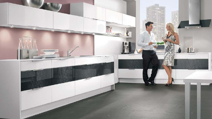
Take the Highlight kitchen style (above) from Nobilia, the German kitchens giant. When we saw it at the Nobilia factory visit in the autumn of 2012, we noted Nobilia’s boldness but questioned whether it would be a popular seller in the UK market.
From speaking to those who sell Nobilia, it would appear that the Euro market for the Nobilia Highlight door is greater than the UK market but what we are finding is that some of the smaller more niche Nobilia dealers are using it as a showcase design owing to its uniqueness.
Whilst (like Marmite) the Nobilia Highlight door does divide opinion in terms of like it or love it, it does unite opinion in regards to showing that German kitchens are not all white gloss handle-less offerings and that there is more on offer and this is why having it in showroom makes sense. It may not have mass appeal but it does offer something different, something to attract an audience, and it’s this quality that gets people talking, and visiting showrooms.
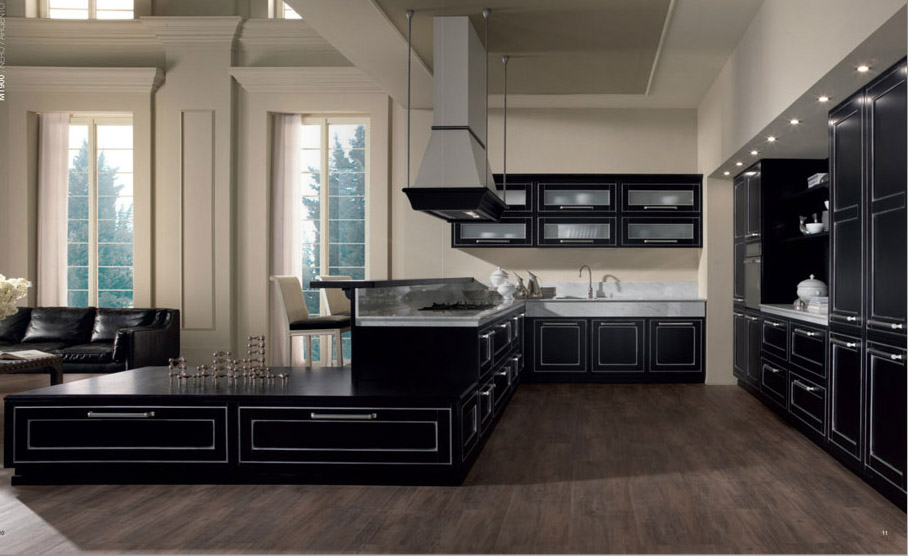
So then, on to the MT900 by Miton, Bold as the Highlight from Nobilia, or Beauty only a mother could love?
Whilst the small team at Kitchens Kitchens can appreciate the Highlight door by Nobilia as being a Marmite type product, in that it evokes a "Love It or Hate It" feeling, and which Marmite seized on with their marketing, which embraced the truth that Marmite is a strong flavour, which evokes strong feeling, whether you do "Love It or Hate It", the MT900 seems to be less Marmite "Love It or Hate It" and just “Hate it”.
The Highlight door combines modern contemporary feel with textured tones and when contrasted with a white gloss, the overall design, as we have seen in some showrooms, does work. The MT900 by Miton however, doesn’t seem as accomplished.
It maybe down to the fact that the door style, having remnants of shaker style in the panelling, but being marketed as “ultra modern” which doesn’t feel right makes for a confused assessment or it maybe down to the fact that our Jeff Russell once had a tacky shirt some 10yrs ago, that it reminds him (and now us) that the MT900 is a bit behind the times but nevertheless, whilst Miton have some funky and cool retro and proper ultra modern kitchen styles, the MT900 isn’t one of them.
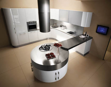
To balance the poor show of the MT900 out one such design we do like by Miton is the MT700G, which as you can see from above, is World’s apart from the MT900 and more deserved of the label “modern kitchen”.We particular like the curves that Miton have used in this design, which similar to the Wave by Bontempi but taken a step further with a lovely, chunky and curved metallic worktop on the peninsular really does create something unique and bold.
